Data visualisation
This service involves creating visually appealing charts that are quick and easy for your readers to understand.
Data visualisation − or “data viz” – means making it easy for people to access, understand and “visualise” data.
Using visual elements (such as illustrations, diagrams, tables, lists and charts) in documents is an effective way to convey complex information. It also breaks up dense chunks of text, which makes documents seem more appealing and less overwhelming to read. Presenting data clearly like this is an important part of plain language.
People find it much easier to see data trends, patterns and outliers in a chart than they do in words. When you give your readers a well-designed chart, they can quickly grasp, discuss, interpret and apply key insights about the data.
It’s easy to create a chart in Excel that you can pop into your document. But making sure that a chart tells your intended story − clearly and unambiguously − takes planning, care and practice.
If you use charts that are poorly designed and hard to understand, you risk confusing and alienating your readers.
Capire’s data visualisation service will give your organisation clear and beautiful charts that add value to your documents and impress your readers. We use techniques that highlight the important information in your charts and take away the noise.
Here are some examples of our work.
Bar charts
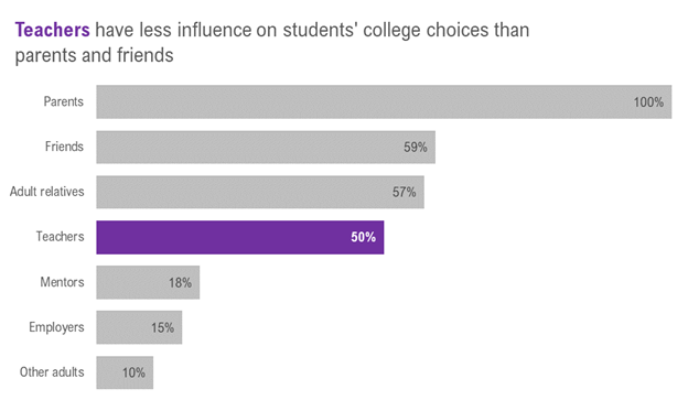
We transform standard Excel bar charts…
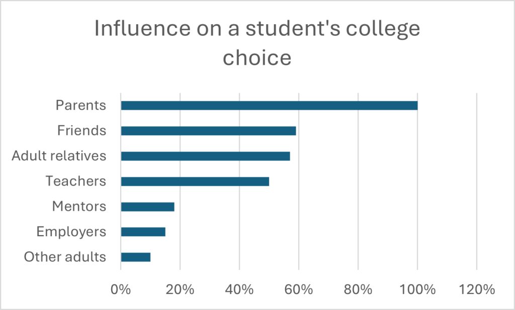
…into meaningful charts that tell your data story.
Clustered column charts
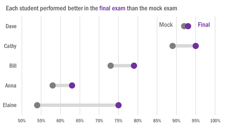
We transform standard Excel clustered column charts…
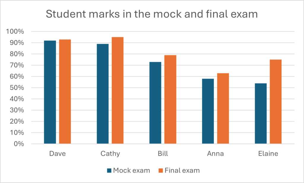
…into charts that make it easier to compare two variables, like this dumbbell dot plot.
Column charts
Excel’s standard approach to displaying a single dataset is a bar or column chart.
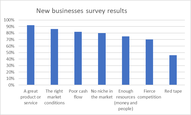
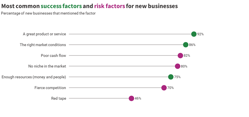
We use charts that make it easier to see the differences within a single dataset, such as this horizontal lollipop.
Our data visualisation service
Our data visualisation service includes:
- advising you on which of your information would suit being displayed in a chart
- advising you on which types of charts are most effective for your data
- helping you identify the main messages in your data to highlight in charts
- creating charts that you can insert into your documents
- adapting your existing charts to make them effectively convey your key data messages.
Capire is a member of Dr Stephanie Evergreen’s Data Visualization Academy. Our services draw on the tools and techniques we have learnt in the Academy.
Capire is a leading New Zealand writing consultancy for governments, NGOs and international development agencies. We help organisations transform their complexity into plain English. Find out more about how we can help your organisation or sign up for our newsletter to get more tips to improve your writing.
What our clients say
Helen has a great eye for finding the gaps and making sure everything stays consistent and on message.
Christina Hoey, Director of Fundraising, Save the Children NZ
