How to use a chart to explain what your data shows
Charts are a great way to present data
When you’re writing a report or proposal, you’re likely to have data that shows your productivity or results, or that supports your findings and recommendations.
It takes a lot of words to present data and explain what it shows. So, it’s common practice to display data in a chart, table, dashboard or other visual form.
Using a chart can be an effective and powerful way to present data. A well-designed chart takes up less space than a complex written explanation; it’s also much quicker and easier for readers to understand.
Charts need to be carefully planned and designed, or they can be messy and confusing
Excel makes it deceptively easy to create a chart. It takes seconds to highlight some data and insert a bar chart, pie chart or line graph. For example, here’s a line graph that Excel created for two rows of data about the number of female world leaders between 2000 and 2024.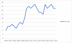
Without taking some care to plan and design a chart, the result can:
- look messy
- be difficult and time consuming to read and interpret
- present data that is unclear, misleading or inconsistent with your text
- leave your readers confused and frustrated about what the data means.
Use these tips to make effective and powerful charts
The technical term for presenting data in a chart, diagram or picture is ‘data visualisation’. Data visualisation is a huge topic, but there are four straightforward ways to make sure a chart effectively explains what the data shows, so they add value to a document.
Tip 1: Understand the purpose of the chart
Before you create a chart, be clear about the trend, pattern or finding you want people to see in it. Have this purpose in mind as you design your chart, and use it in the chart title.
Tip 2: Understand your readers
Think about the people who are going to look at your document. Consider how well informed they are about the topic, and what they need to know about the data. Make sure you adjust the purpose, message and chart type to suit your key readers.
Tip 3: Choose the right type of chart
Excel has many chart options to choose from. Select the type of chart that works best for your data, purpose and audience, and that will best display the message you want to convey.
Choose a chart type that people find easy to understand. We know that people find it easier to interpret charts that show position, length or direction, than charts that show volume or curvature.
If you need help finding the best way to present your data, my data visualisation service can help you.
Tip 4: Organise the chart to make your message stand out
There are lots of different ways to format a chart. These basic formatting tips will help make sure your chart achieves its purpose.
- Order the data logically, for example, by size (least to most, or most to least) or date.
- Use colour intentionally in the chart features, data labels and chart title, so that it highlights patterns and draws readers’ attention to the key point.
- Avoid distractions by removing any redundant features in the chart (such as gridlines, chart border and axis tick marks), and use a legend, axes or data labels, but not all three.
- Use a font and font size that people can read easily.
By using these tips, I improved the simple line graph about female world leaders to clearly present one finding about this data.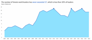
Rate your own data visualisation skills
If you want to check the quality of one of your own charts, you can upload it to Stephanie Evergreen’s free online Rate My Visualization tool. The tool will score your chart and link you to free resources that you will help you work on any weak areas.
Capire is a leading New Zealand writing consultancy for governments, NGOs and international development agencies. We help organisations transform their complexity into plain English. Find out more about how we can help your organisation or sign up for our newsletter to get more tips to improve your writing.


